
Richardson Olmsted Campus
Brand Development
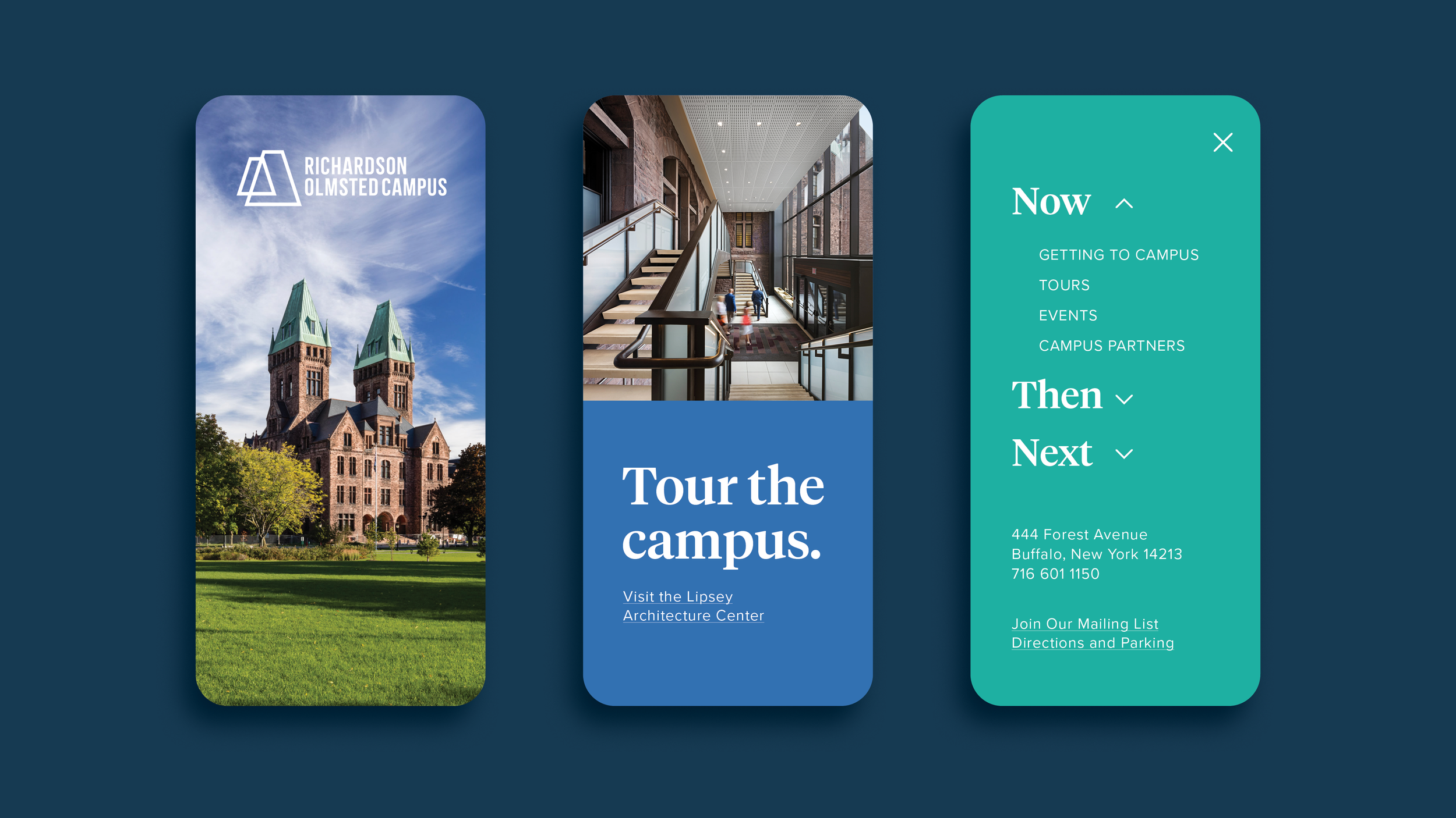
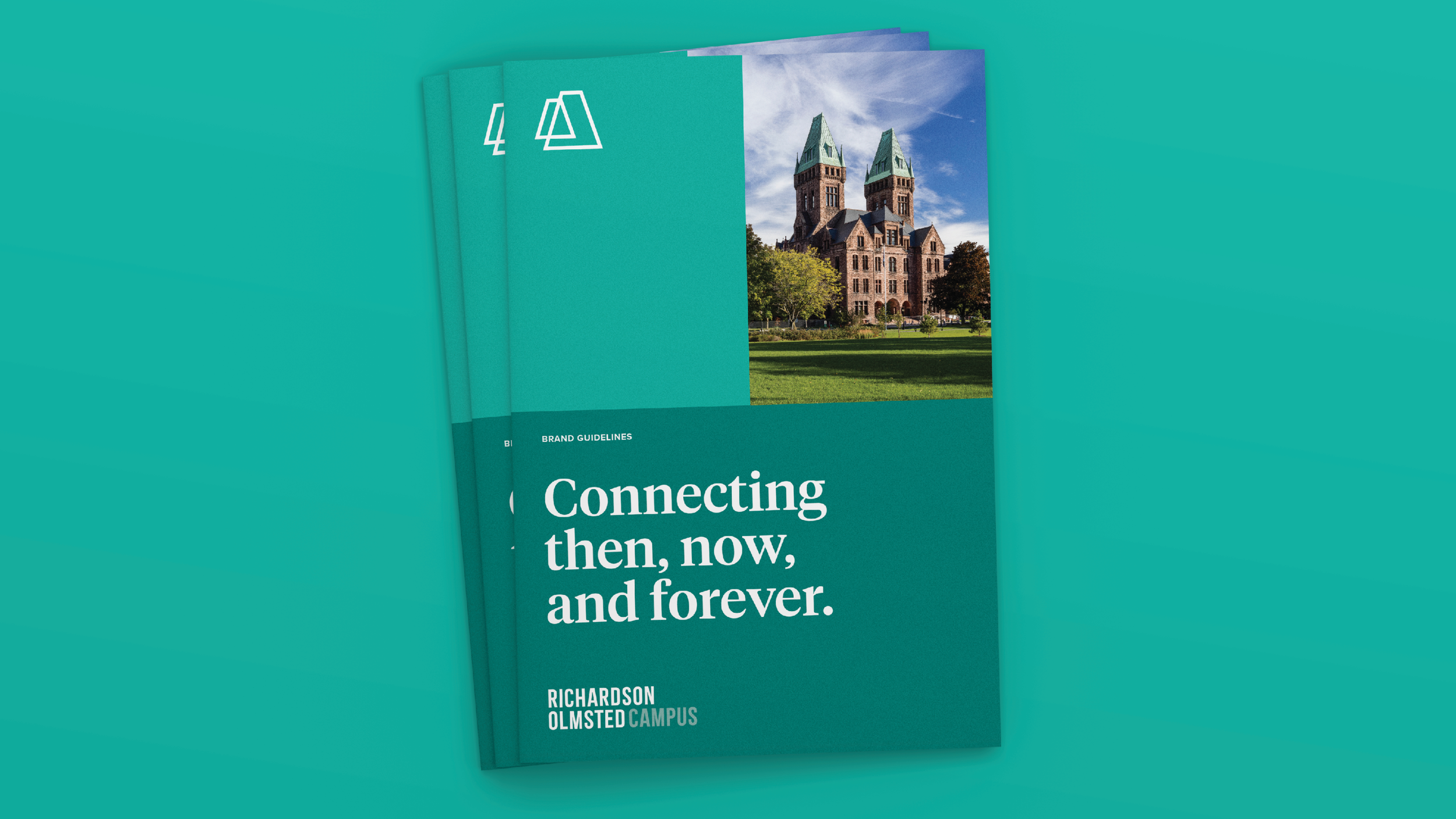
The Campus team engaged White Bicycle to spearhead a brand development process that included discovery and brand positioning; brand architecture; visual brand development; and the brand’s rollout, including a new website and two distinct brand books tailored for the internal team and campus partners, respectively.
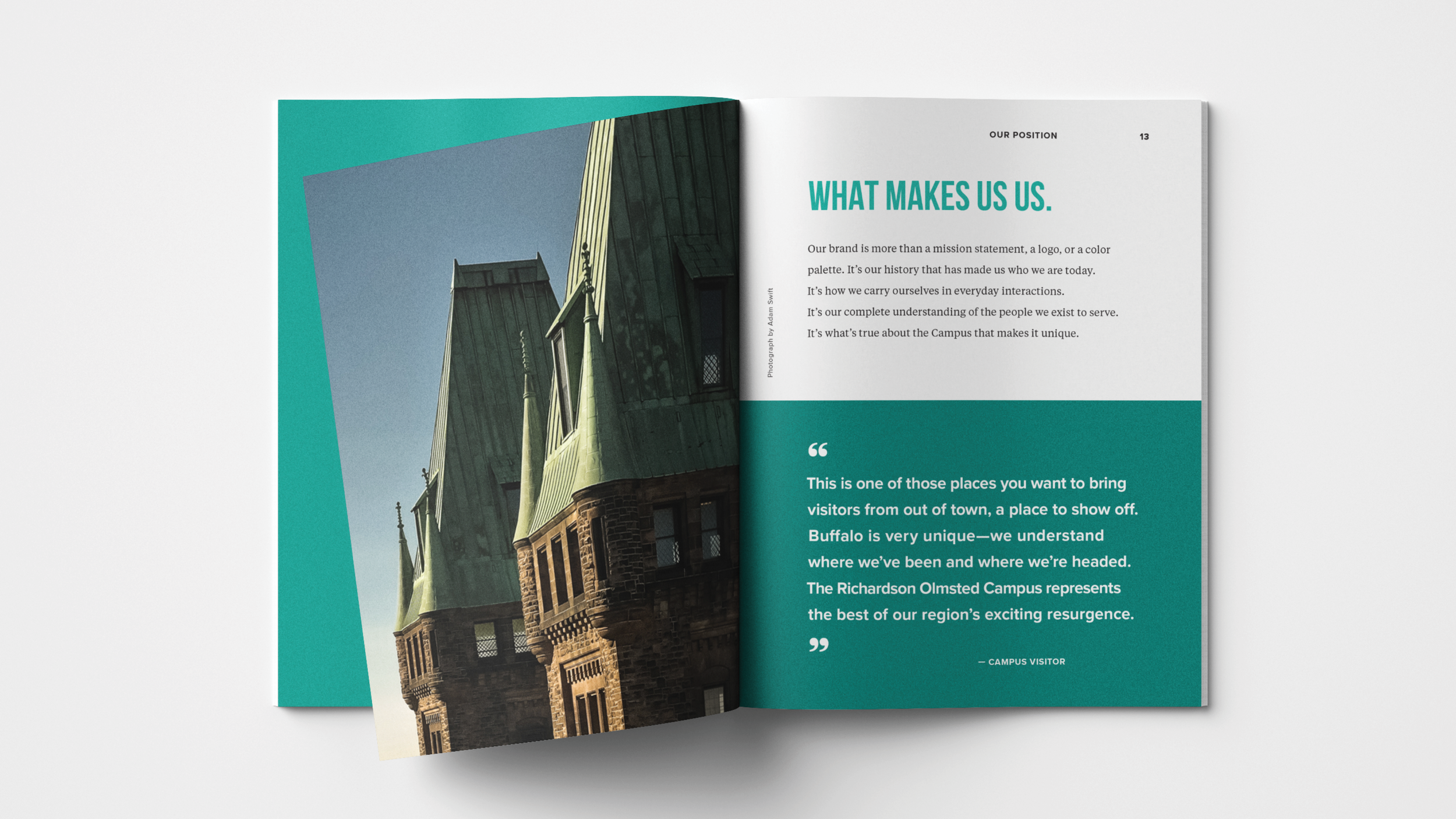
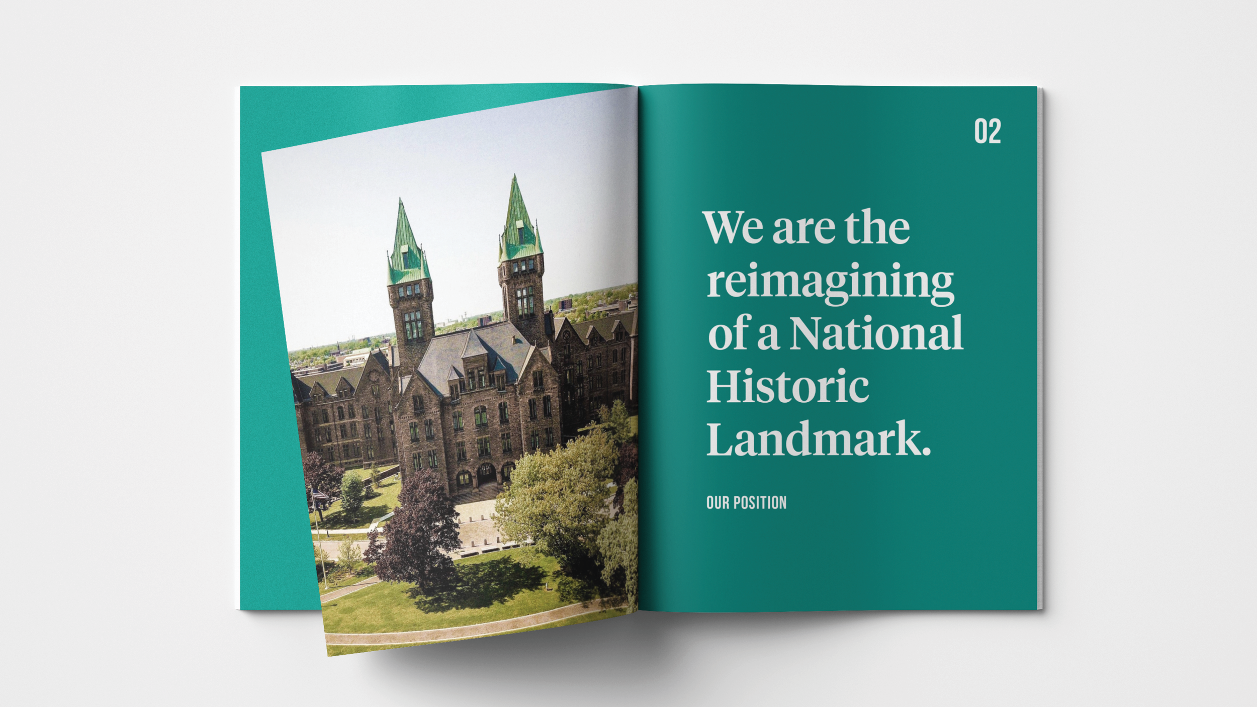
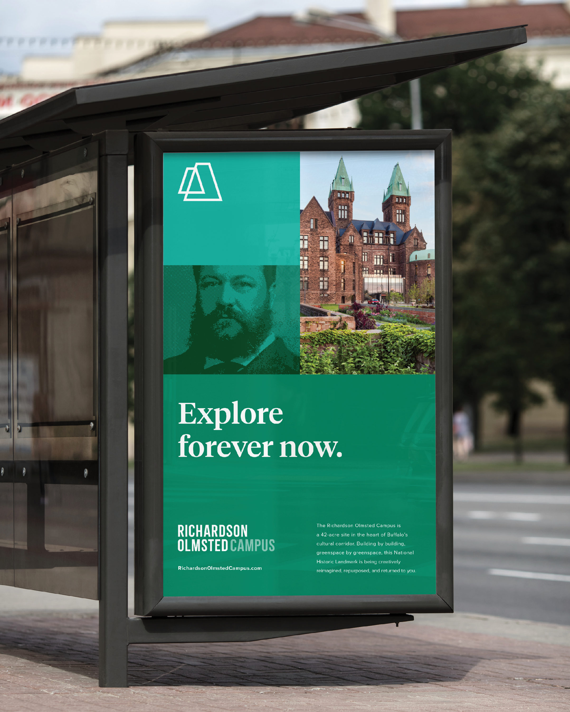
The Richardson Olmsted Campus is home to one of the most impressive architectural achievements in Buffalo’s history. Through decades of highly successful development, the Campus delivered on its promise to return this Richardsonian masterwork and Olmstedian landscape to the Buffalo community.
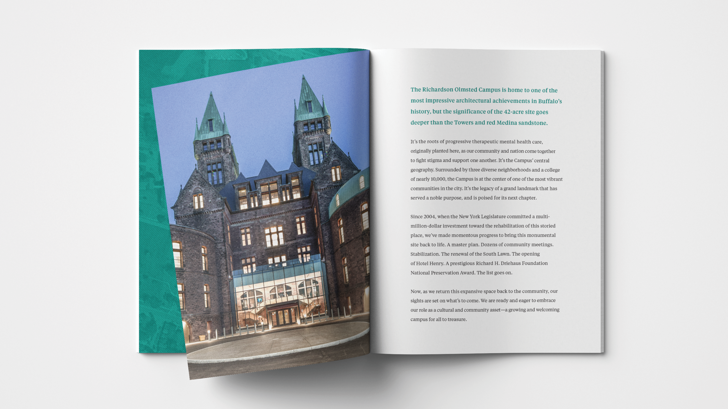
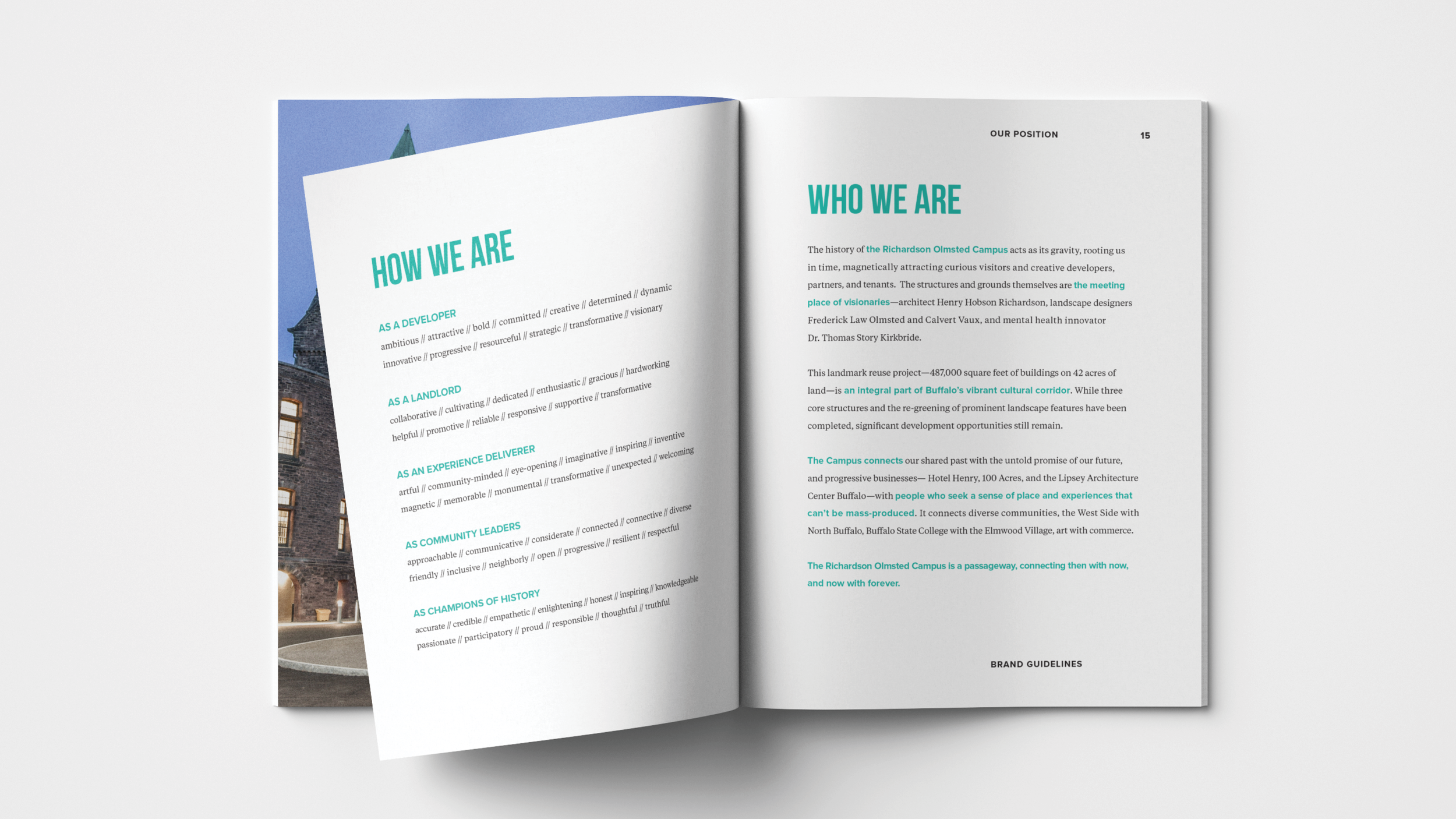
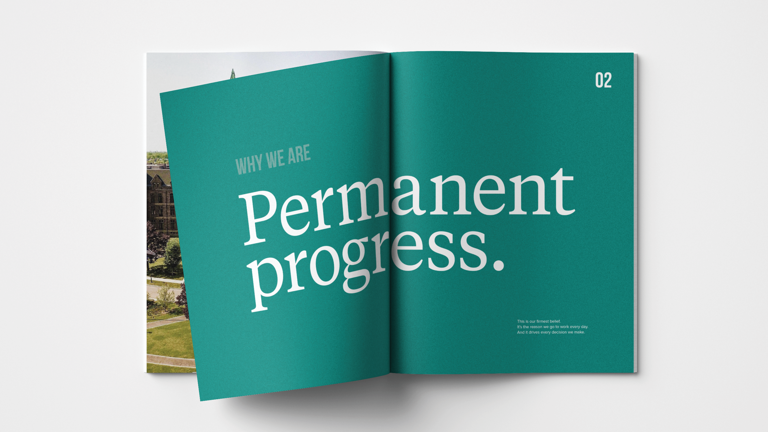
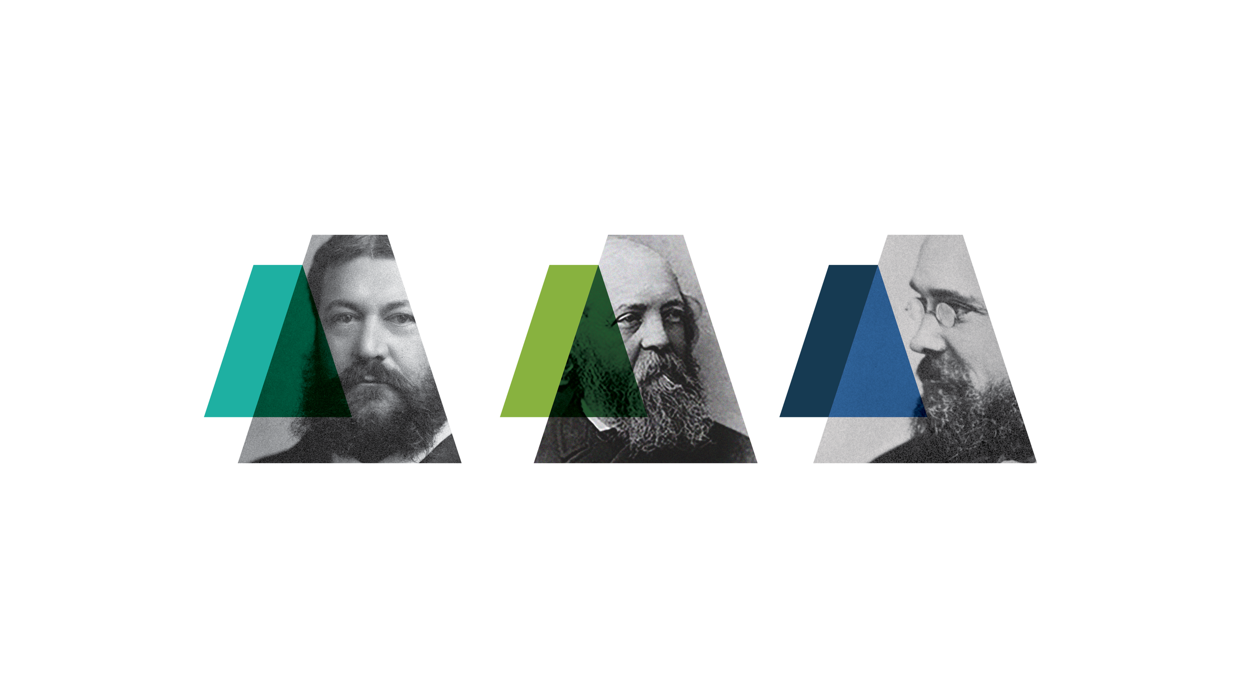
Inspired by the timeless strength of Richardsonian Romanesque architecture—thick walls, sturdy piers, large towers—the position of permanent progress emerged. On its face, a total contradiction, but with the architectural past and bright future of the Campus, the position aptly captures both what's happened and what's happening.
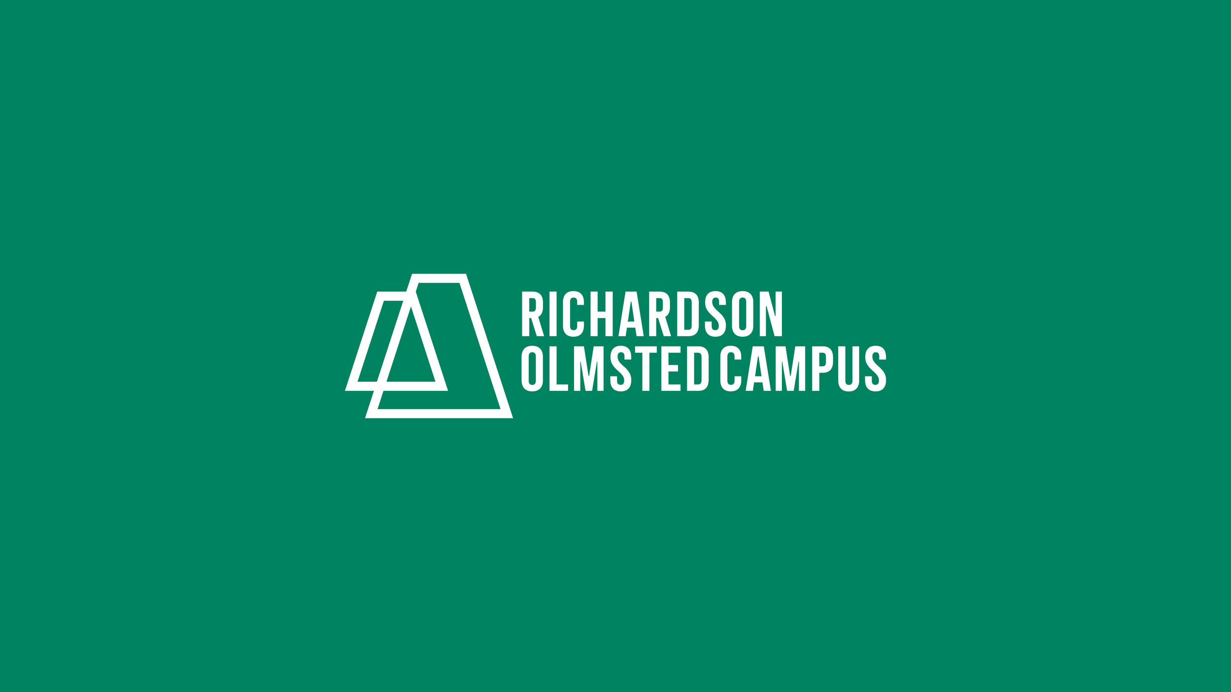
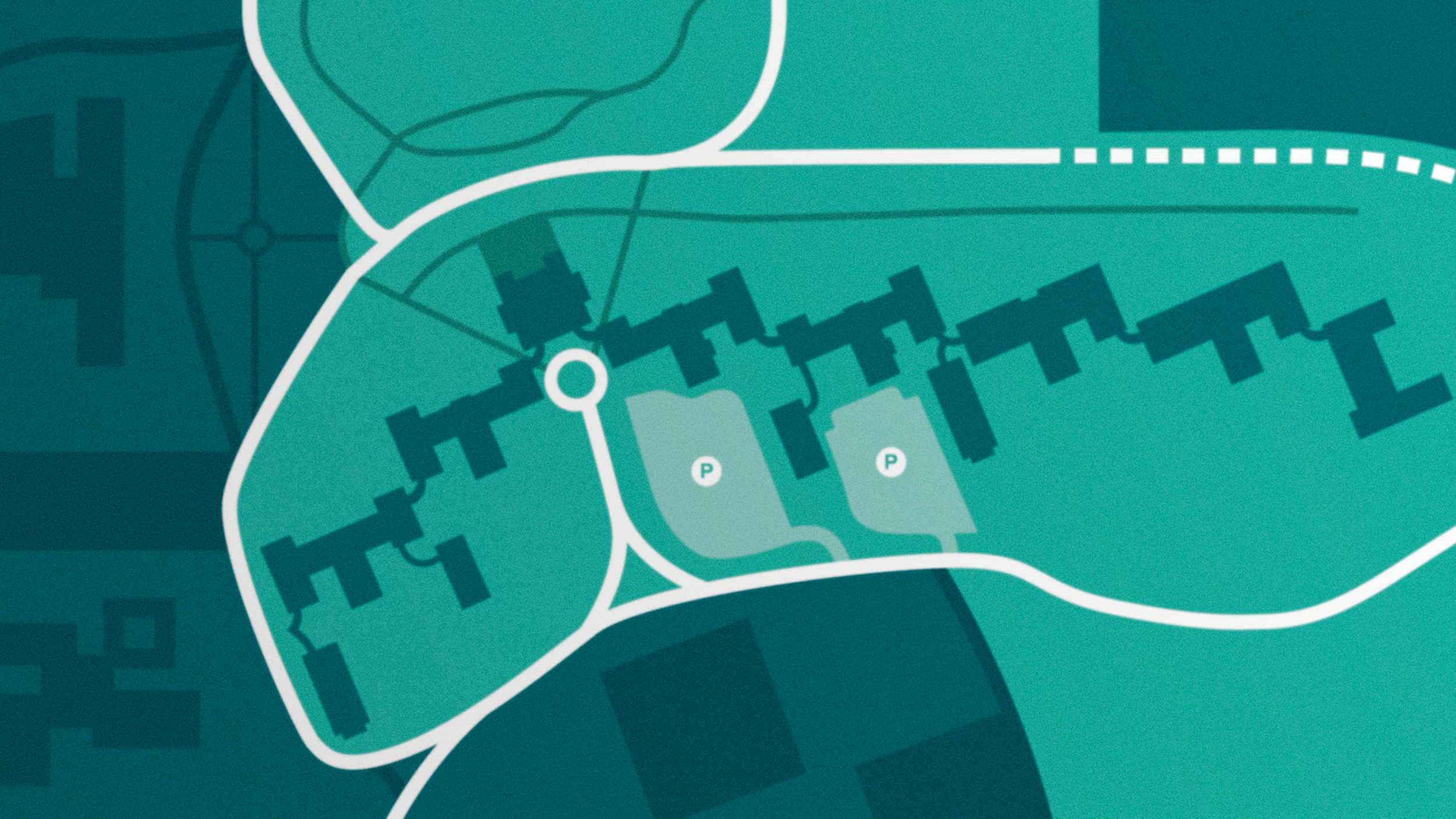
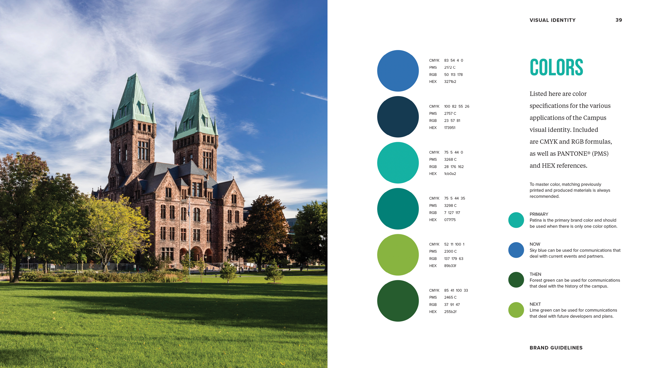
The Campus visual identity keyed off this position, highlighting the iconic towers in perspective to create a triangle within—a symbol of change. A complementary seal was added to the system for use on official documents between the Campus and campus partners, such as memos and lease agreements, while the brand’s color palette drew from the elements on the Campus: patinated copper, lush green grass, blue skies.


A small object with big meaning—these custom enamel pins were given to board members as part of the brand rollout, honoring their role in shaping the next chapter of the Richardson Olmsted Campus.


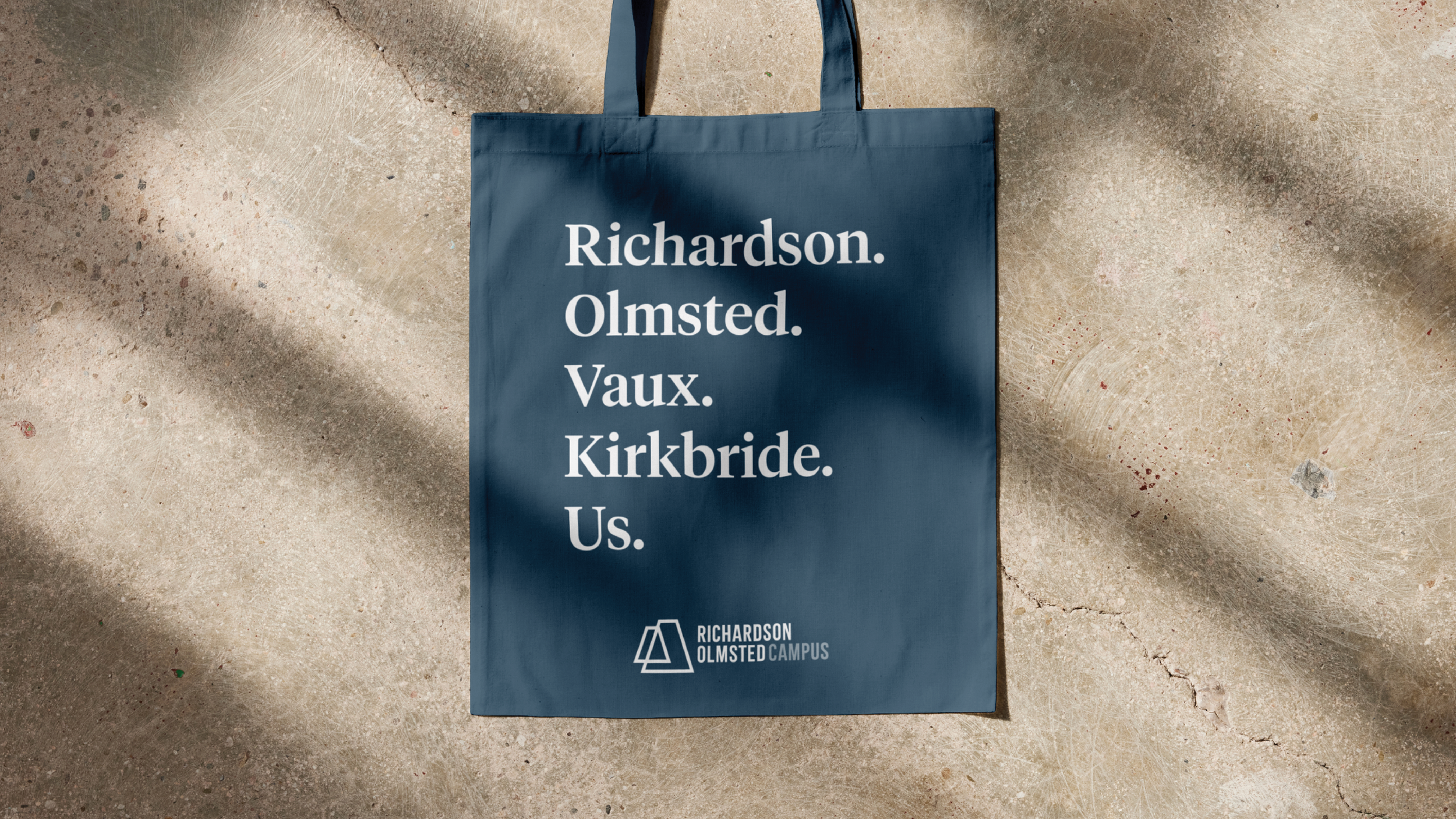
The Richardson Olmsted Campus seal is intended for limited, special use only. This element distinguishes official documents as from the Campus.