Buffalo Central Terminal
Brand Identity
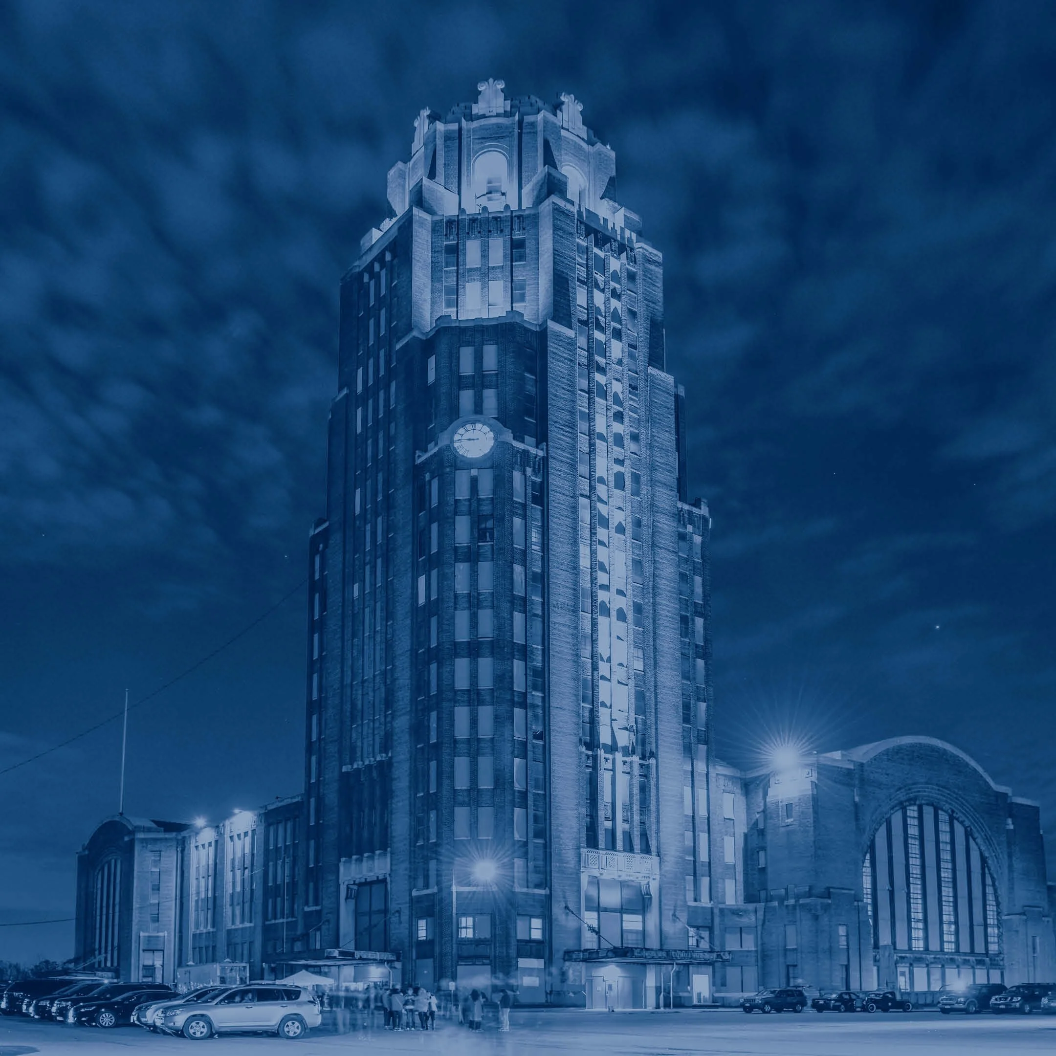
The Buffalo Central Terminal, once a bustling transit hub welcoming over 10,000 daily visitors since its 1929 opening, stands poised to reconnect Buffalo in a new era. Nearly a century later, this iconic landmark is undergoing a comprehensive adaptive reuse—transforming from a historic relic into a catalyst for community connection and renewal.
As the most prominent structure in Broadway-Fillmore and one of Buffalo’s last great legacy buildings to see meaningful reinvestment, the Terminal’s revitalization represents more than preservation. It is a vitality project with citywide significance—grounded in the neighborhood it overlooks, rooted in the communities it serves, and rising as a symbol of shared momentum for East Buffalo and beyond.
Through a close partnership with the Buffalo Central Terminal, White Bicycle developed strategic brand positioning, identity & messaging, and a brand activation approach that transforms the Terminal as a catalyst for community connection and reinvestment. The work honors the site’s historic legacy while building momentum for its future as a dynamic civic hub in the heart of East Buffalo.
Three words build a narrative stories high and acres wide. Buffalo—a city of good neighbors reaching forward to share the strength of her past with everyone. Central—a gathering place at the heart of a diverse community in the heart of a vibrant city. Terminal—both the end of the line and the beginning of every new adventure, a place to plug in and connect. Regardless of destination, in this journey we are forever arriving, building new futures together.

The color palette was designed to be both ownable and meaningful, capturing the essence of the brand while allowing for modular flexibility.


Treated imagery was developed to support the identity system—designed for use behind type-driven messaging, these visuals complement full-color photography across communications.

The Central Terminal’s creative thematic is the outward expression of the brand’s position—building momentum together. Modular in nature, the thematic platform creates versatility that can be leveraged as headlines in designed applications. Each extension highlights a strength of the brand and provides an opportunity to customize and highlight facets of the brand in a way that is relevant to each unique audience.


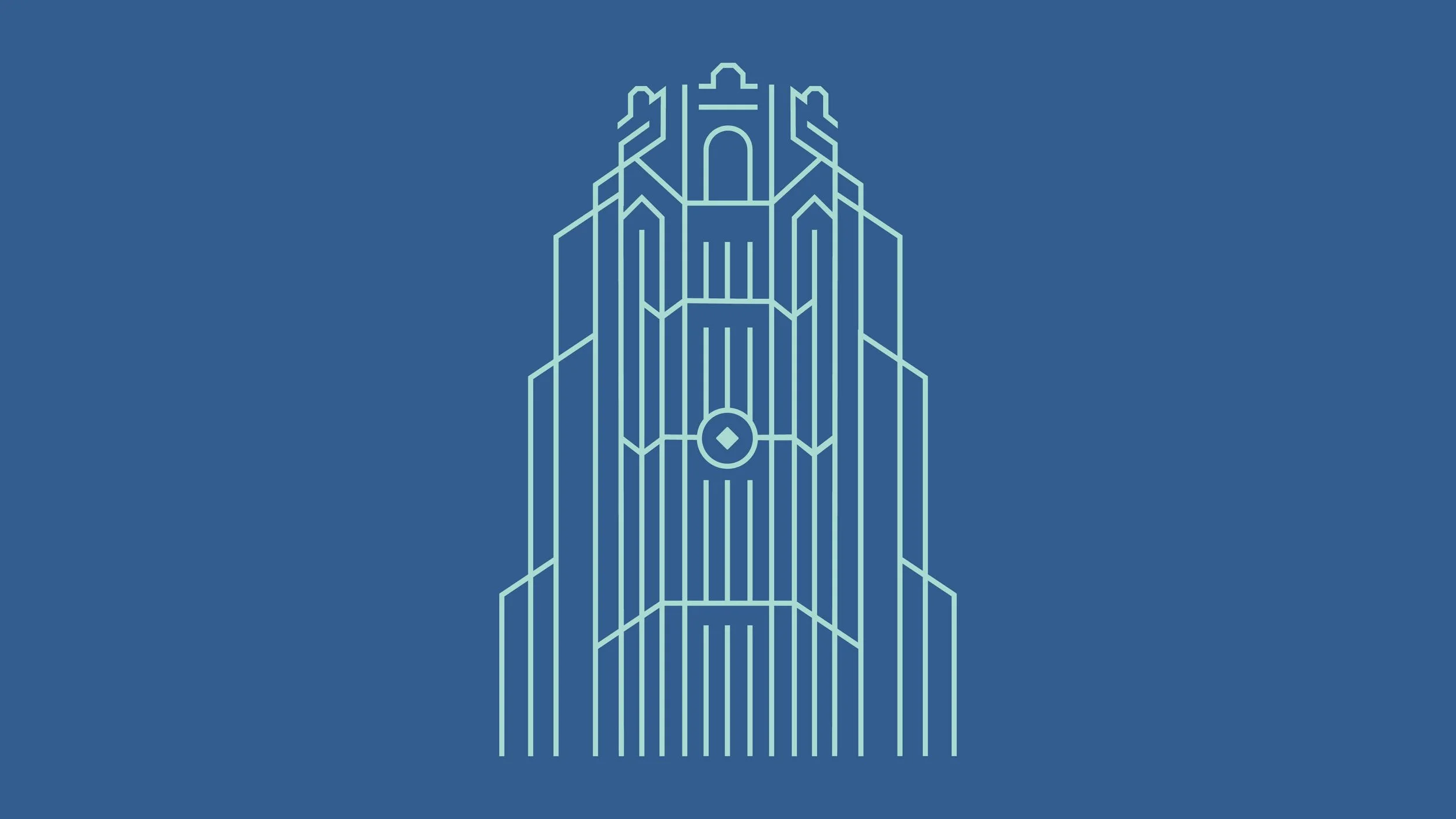
Inspired by the towering silhouette that defines Buffalo’s East Side skyline, this illustration distills the Terminal’s vertical grandeur into a clean, symbolic form. It serves as both a visual landmark and a flexible storytelling tool—its shifting colors and applications reflecting the multi-phase vision of the Terminal’s renewal.
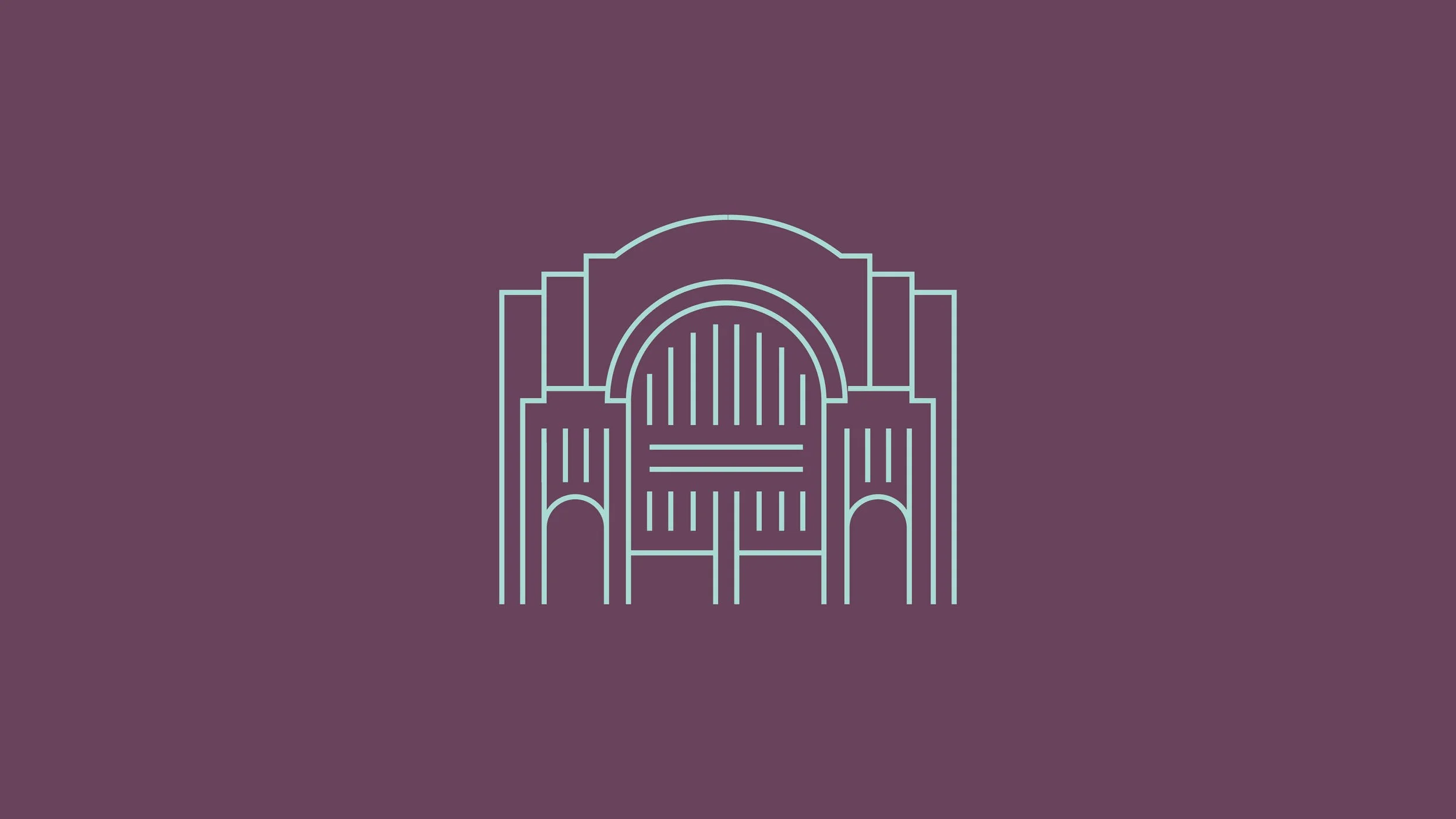
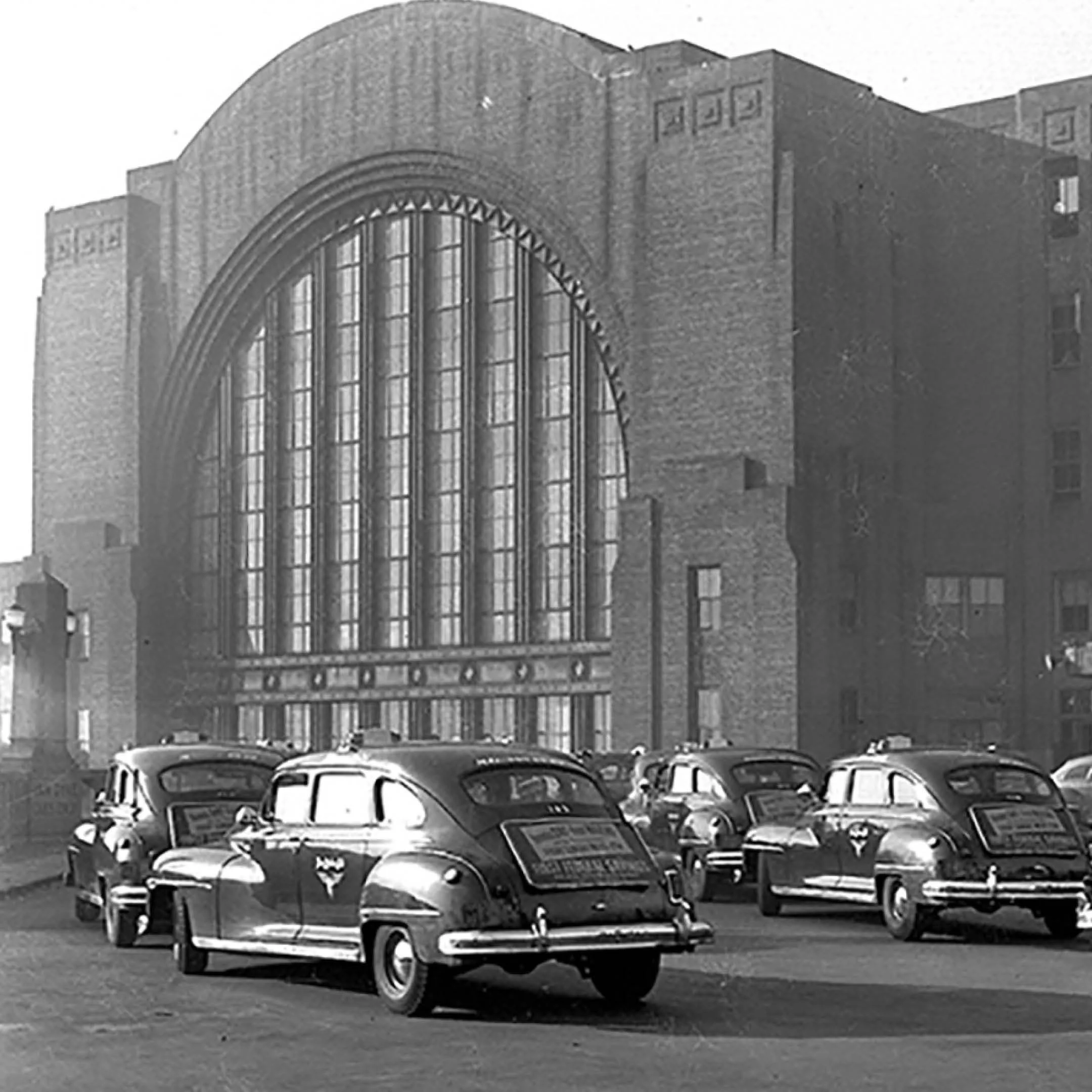
Drawing from the sweeping curves and intricate details of the Terminal’s Art Deco design, this illustration reinterprets the Archway as a clean, linear form. It draws from historic imagery to highlight the elegance and craftsmanship embedded in the building’s original architecture.

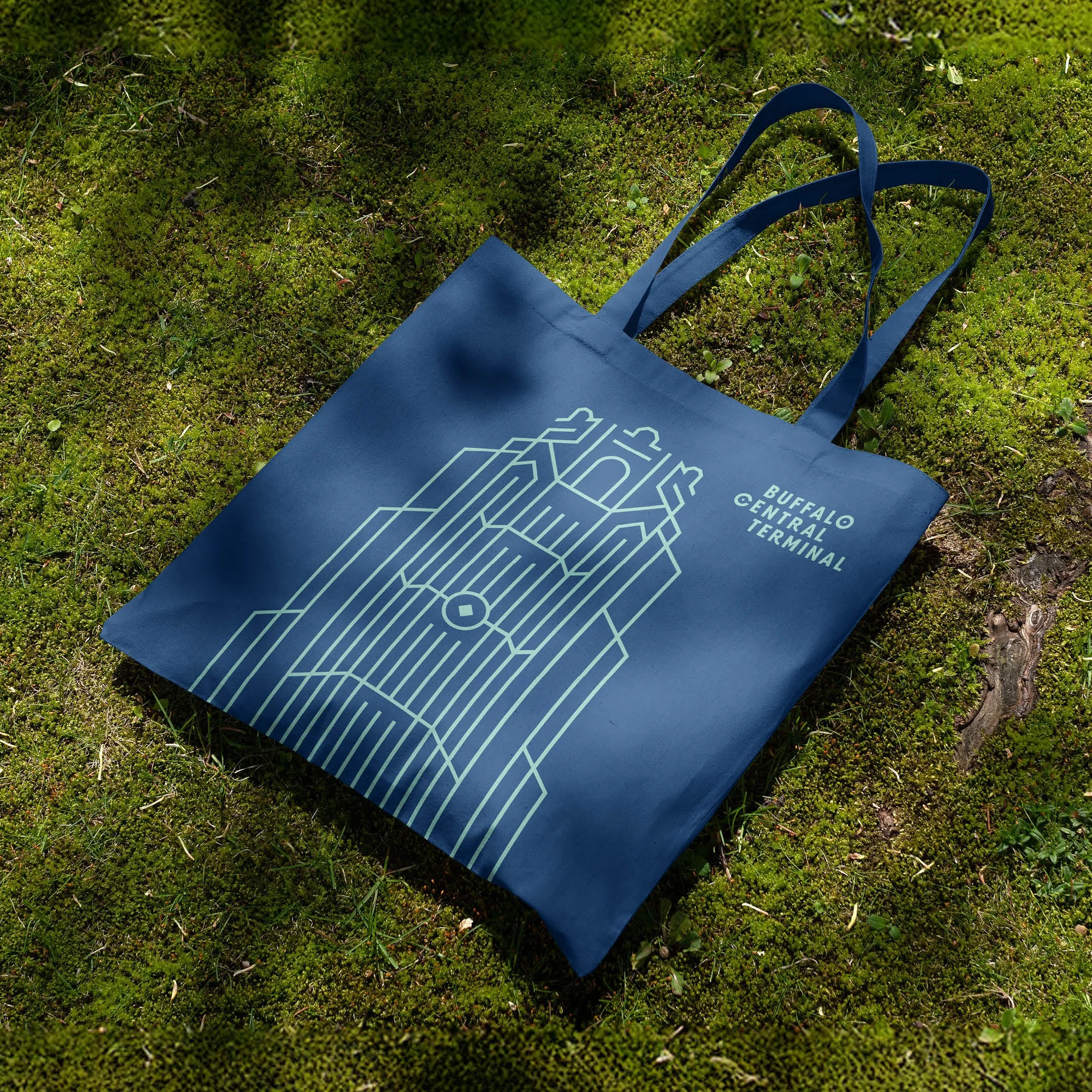
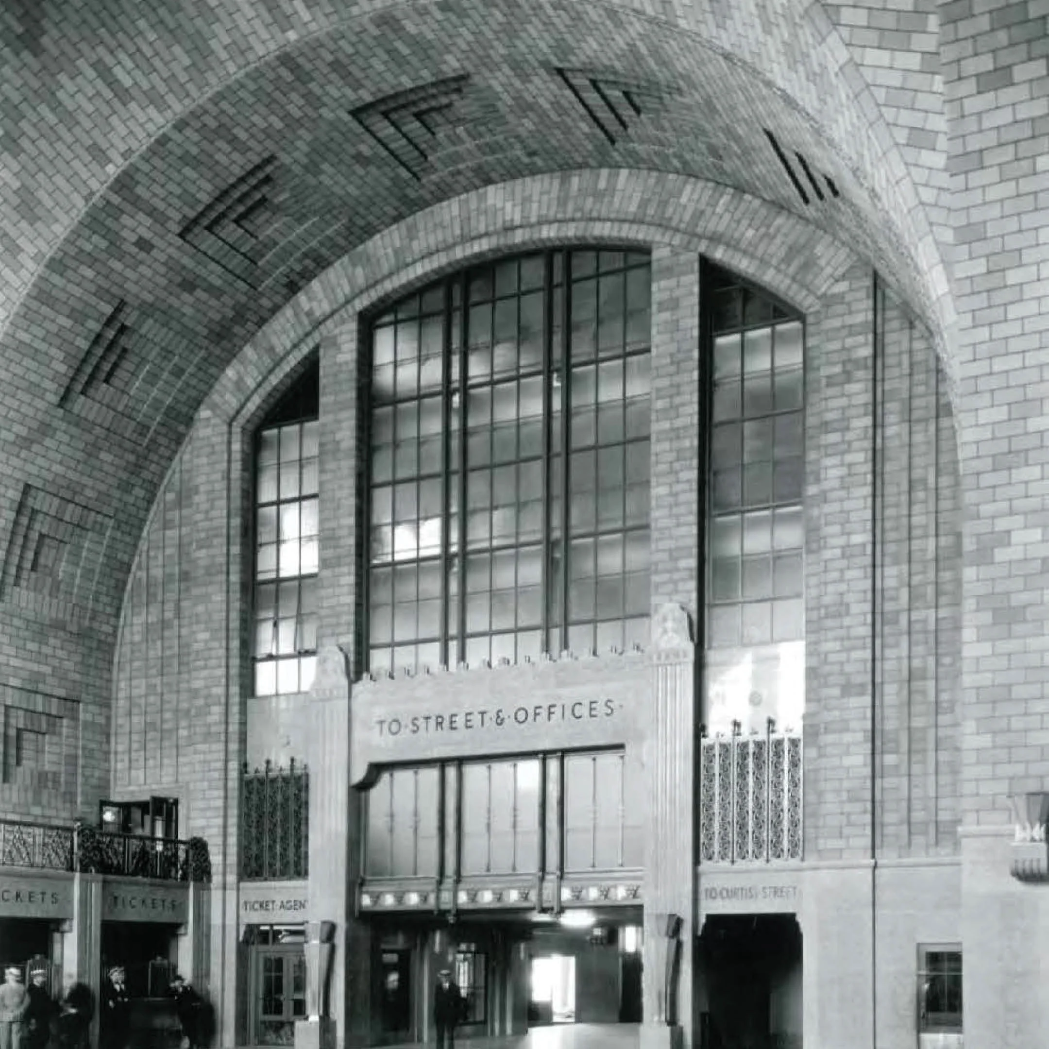
This illustration extracts the grand scale and symmetrical rhythm of the Terminal’s main concourse into a refined, linear form. Informed by both archival and contemporary imagery, it reflects the building’s enduring presence and the timeless clarity of its Art Deco architecture.